The Odyssey of my Logo
What’s This?
The logo you see is the successful culmination of creative trial and error. My initials displayed in such a way to lock the viewer’s eyes and make them eager to learn about what I do.
Why did I decide to use shark motifs? Short answer, I like sharks.
Real answer, I wanted something in my logo that would be memorable when compared to others, while simultaneously expressing my individuality and showcasing that I dabble in creative work. I feel like using shark imagery achieves all of those things.
My Process
Starting out was probably the hardest part of making this design. I began by sketching several ideas for logos involving my name and initials in a clever way. My creativity eventually slowed down after enough time, and that was when I decided to narrow down my list.

I was stuck between two sketches: 9 and 5. I decided to tinker around with sketch 5 in Adobe Illustrator, and I almost decided to settle with it. I liked the idea of having all my initials form one novel symbol, but it could’ve been the R and G letters not being the same size as the D that made me want to try a different design. I put my work to the side in case I wanted to come back to it, and started to work on sketch 9.
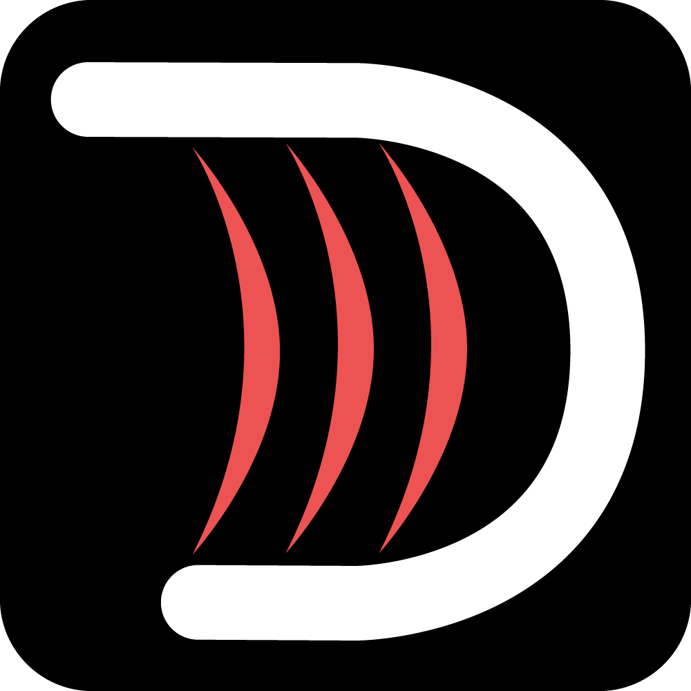
Something with this design really hit home for me. The way every letter had to share a portion of itself to the same set of vertical lines. The clashing streamlined font compared to the dynamic shark-gill slits. It was a design that I felt like represented my brand. I reflected the slits differently from my sketch and gave them a gradient red color. I presented this logo for some fresh eyes to criticize.
Some viewers were confused about the slashes, and I had to explain to them that they were shark gills. They suggested that I make my logo a shark with my initials on its body. The idea was so crazy, I had to follow through. I spent more time in Illustrator to create a shark that I really felt content with. I traced my initials onto the shark’s body, and the draft was complete. However, the criticism returned in a different way. The viewers loved the shark image used, but now my initials were too difficult to make out. I was at a crossroads, until a light bulb went off in my head.
After giving the shark some more details, I combined it with my previous streamlined letters to create the logo you now see on this website. The criticism I received after showing this was minimal, and came down to peoples’ personal preference. I also took this time to create a favicon, using the D in my initials and combining it with three shark gills.
